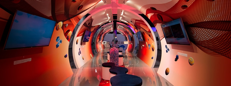
Stand design is all-important. There’s the obvious impact of the stand itself – how it attracts people in a crowded exhibition hall. Then there is the experience design – what it feels like to visit, what visitors learn and what they take away with them.
In classic terms, it’s a matter of form and function. Poor form often stands out more than good. It interferes with function, to the point where visitors may only remember a clumsy first impression, a confused space, a disorganised hospitality bar – these things mean they may not take away your brand message at all.
The stand has to look great, it has to have purpose and offer value. Above all, it has to work seamlessly.
Aesthetic design
Strong aesthetic design is distinct, novel and consistent.
It draws on a brand’s established imagery, vocabulary and style. A stand should speak the same language as the materials the visitors take away with them and the content they engage with through digital channels. This is doubly important if you have a website or app for the event: the digital enhances the real-world experience at the stand, but this works most effectively if all elements retain a consistent identity and are aiming at the same outcomes.
Aesthetic design is rooted in colour theory and shape theory. The appearance of a stand is designed to create the emotions you need your visitors to feel. Warm colours and soft forms generate different feelings to angular forms and cooler tones.
These elements are some of the tools used by designers to create the emotions and experience you need to achieve with your stand. Perhaps you need impact and focus on one powerful statement that must be embedded, or you may want to remove mental barriers, creating relaxed and consultative discussion based interactions?
Good aesthetic design helps these objectives to be met. It empowers the people who work on stands. The best design will help to motivate them, appearing their best to visitors.
At this stage, it’s worth thinking about materials and textures. In the artificial, indoor environment of the typical exhibition hall, natural materials can really stand out. Used cleverly, they can help promote a feeling of wellbeing and creativity, offering a different atmosphere to the bulk of the show.
Elements like this can create a natural draw for visitors. We have all walked into spaces that have made us feel good, without being completely conscious of why. All we know is that we are happy to spend time there and we may feel more relaxed and receptive. When you think about it, this is powerful stuff. And what about soundscape? An exhibition hall can be a noisy and overwhelming place. Is there something to consider here? A possible break from that? How do you want your visitors to feel?
This is why we are calling it aesthetic design rather than visual design: making the stand feel and sound right as well as looking right.
Experience design
The first key question for experience design is “what’s the story of the stand?”
‘Narrative’ is a term we hear a lot, but only because it’s so important. The basic principles of storytelling with a beginning, middle and end have a lot to offer here. The experience needs to engage visitors (by offering something new), meet their needs (by offering something of value to them) and conclude it (by leading to involvement and action i.e. what you want them to do). Understanding the pleasure and pain points of your target audience is really valuable for getting this right.
An encounter with a stand should provide visitors with something they take away with them, and we’re not just talking about a promotional gift. It needs to be something positive, powerful and relevant. Something that has the ability to draw them into what you want from them, whether that’s sales, signups or commitment to another encounter. Depending on the messages and your objectives, technology and digital can be a solution, but sometimes a zero technology approach can lead to the best results.
Exactly what you offer depends on your business, products and the market you occupy, as well as whether you are exhibiting B2B or B2C. Display, demonstration, configuration, experimentation, conversation and consultation are some of the many tools for consideration.
Experience design also covers aspects of how you consider and create the physical space too. Movement and control of visitor traffic, key touch-points as well as visibility, appearance and approach of your staff all play key roles within this and should work in complete harmony with aesthetics.
Psychologically speaking, experience design is what helps your visitors create an emotional connection with your brand, beyond any initial statement and aesthetics. It helps build trust and will facilitate achievement of your objectives, which provides the essential return on investment.
Aesthetics and experience go hand in hand when you are putting an exhibition stand together. You have a space to fill: everything it contains should represent your brand and create a narrative for your visitors which offers them a seamless, positive encounter and leads them to do what you need them to do.
Creating the perfect balance of aesthetics and experience is achieved through a thorough understanding of the challenge at hand and the application of intelligent thinking with clever design. When this is done right, you achieve the results you need. When it is done brilliantly, your visitors won’t be the slightest bit aware of the effort that has gone into it. They just feel it.
Subscribe and stay up to date
receive essential emails.


